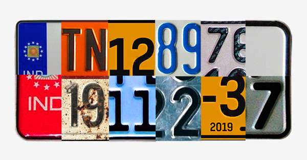
We looked hard at our previous branding exercises. And sought our answers in what our customers felt. And we realised, everything we strived for and stood for, had to reflect in everything about us. Even in the way we looked. We had to wear an identity that was us.
We are seamless, transparent, trustworthy and efficient. Our world is the road: automobile, journeys, engines, distances, people and memories. Our design had to bridge the both.
The new identity had to borrow elements from our world which could project
the inherent core values of our business.
Our new design language stems from popular road sign graphic styles, easily identifiable and globally recognised. Much like how these signs are designed to get the travellers’ attention, the new design language too stands out in a crowded market place, still staying true to the category with bold geometric forms and clean lines.


An insight into our Brand System.
The rounded rectangle leaves enough room inside for the tall letter forms to stand out, along with the diagonal lined pattern which instantly cues the category.

Diagonal line stripes which are our signature. These are simple, defining, adaptive and hold the power to make anything exclusive to Cars 24.
In our eco-system, Zag has been designated a larger responsibility than being just a mere design element. Zag is a symbol of our approach to this business, constantly reminding us of how we do things here. It stands for an outlook that looks at the business holistically and more human-ly. Zag stands for an attitude of problem-solving which need not adhere to conventions. Zagging is always in the direction of the future, exploring possibilities. Zag isn't mere design lines but guidelines that we keep going back to when we feel lost.


Our composition sensibility is clean and visual-led. If there’s photography used, the imagery is real, warm and rich in emotion. The usage of zags lend it our signature.

Our typography too had to be consistent with our inspiration. For the headers,
we sought a typeface that was closer to the tall letter forms in our logo.
For copy, we chose a typeface that complemented the rest, and something that cued professionalism and simplicity.

Clean lines, boxy patterns and rounded edges: evolving from the logo. Transitions and animation that cue in ease and efficiency. An attempt to make icons, iconic.
In the category colours of largely red and green, a domination of blue stands out. The existing primary brand colours of blue and orange were left unchanged.
Blue, though has been made a shade vibrant and dominant within the brand colours.
Our illustration style sticks to the clean geometrical patterns used in our identity. Elements of our world make them relevant, and the overall vibe it gives is of efficiency and performance. Blue remains the dominant colour.


