Wakefit Wakefit Rebranding
Getting that beauty sleep.
Before the rebranding exercise, Wakefit was already the biggest player in the online mattress business. The products delivered had great reviews. It was time to take the step towards a cohesive branding exercise. The task at hand was to give it a fresher look, a new voice, and a distinct personality. With competition cropping up and inconsistencies in brand perception, it was imperative to build the world of Wakefit. Let’s take a look at the fundamentals of this world.
The original logo had to be retained. But with a change in colour, a brush of compactness and a set of guidelines for its usage, the logo fit into the world seamlessly.

For the colours, we drew inspiration from nightfall hues and cool pastels, that are calm to the eyes and stimulate a peaceful sleep.


The primary icons represent the 4 core USPs of Wakefit. They are built from a square grid to maintain maximum legibility under diverse formats. And then there’s an exhaustive set of secondary icons that simplify communication and add a quirky touch to the brand’s personality.


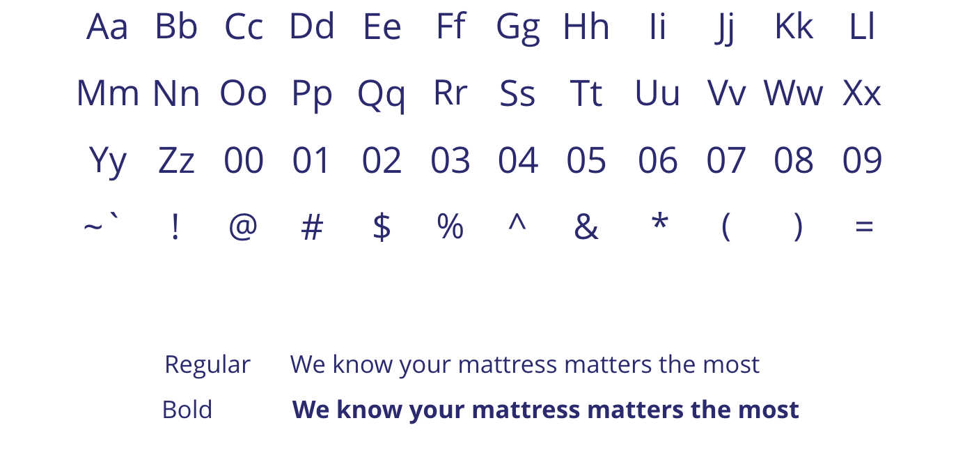
EB Garamond
Wakefit’s primary type, inspired by academic literature. It gives Wakefit a slight academic and nerdy air, suggesting our scientific approach to our products. At the same time, with colours, the font takes on a subtly chirpy personality. This is the font to be used in all the titles and headlines.


Open Sans
Open Sans is our secondary type, to be used for body copy. It complements our primary type seamlessly yet visually separates it from the headlines and titles.
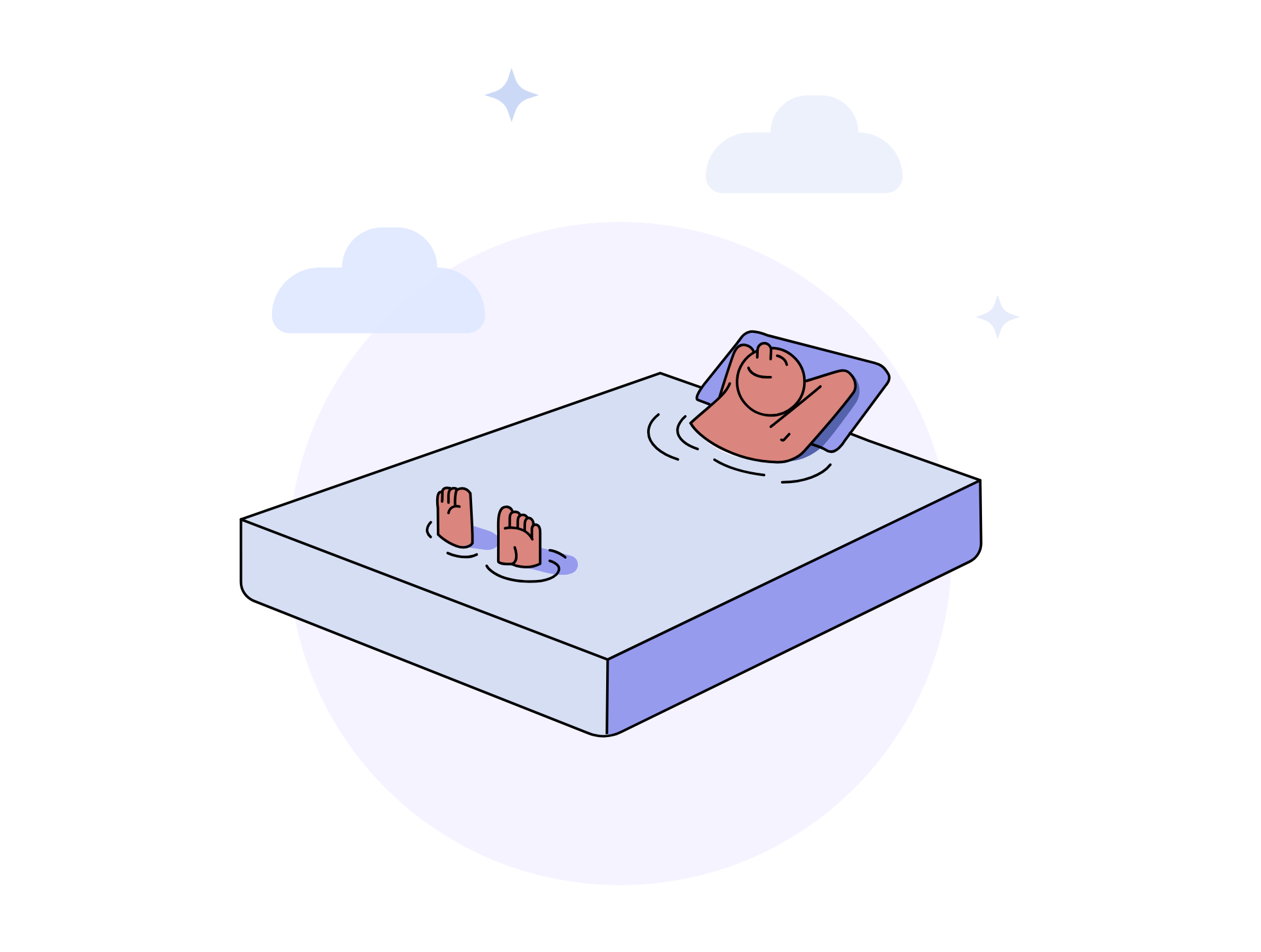
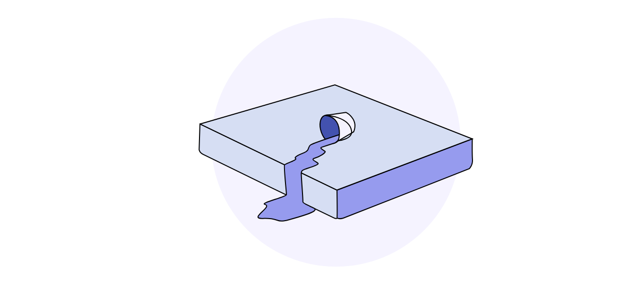
Wakefit illustrations are fun and quirky, rendered in an editorial caricaturish style. Its form is simple and clean, without getting into excessive details. The colours remain from our palette.

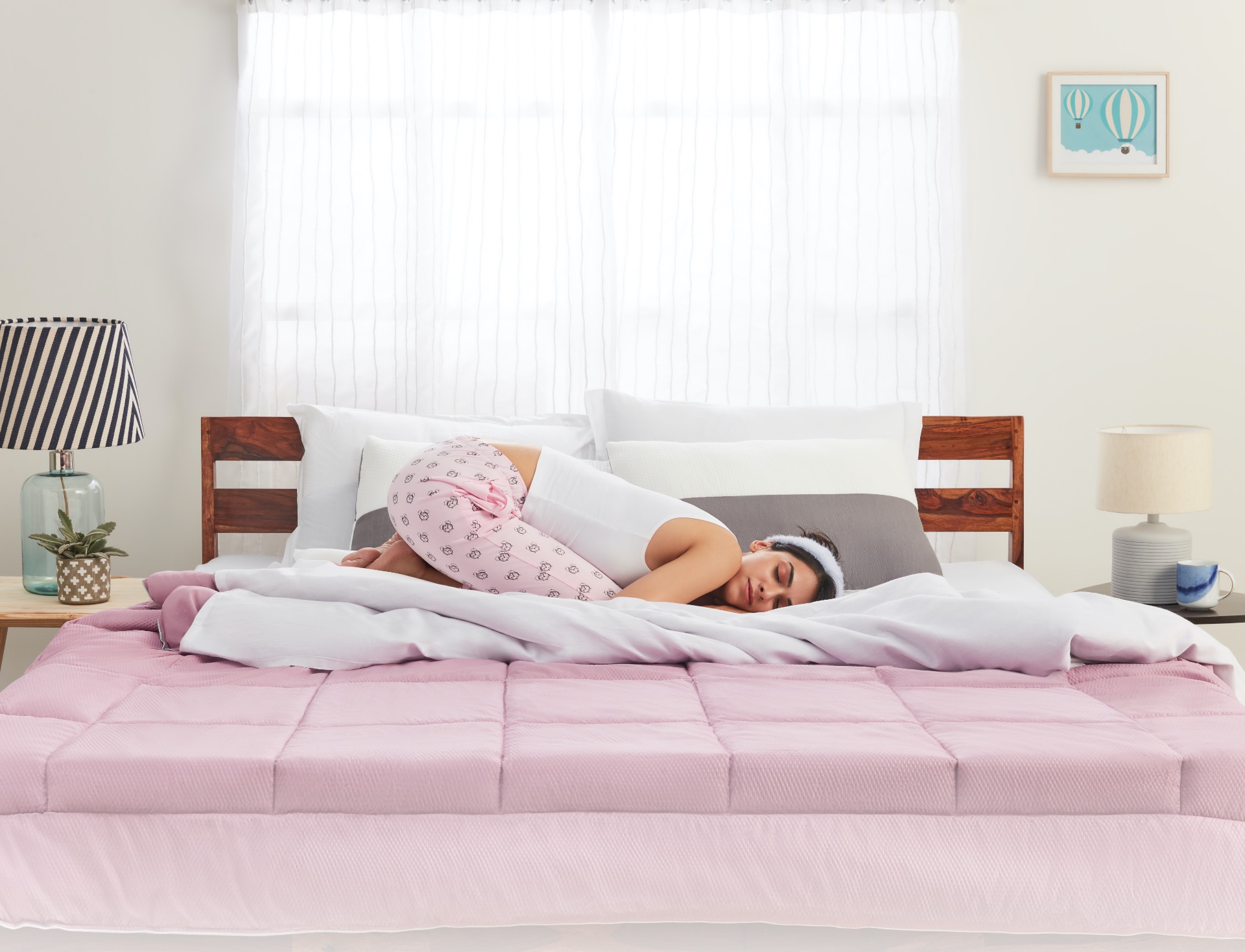
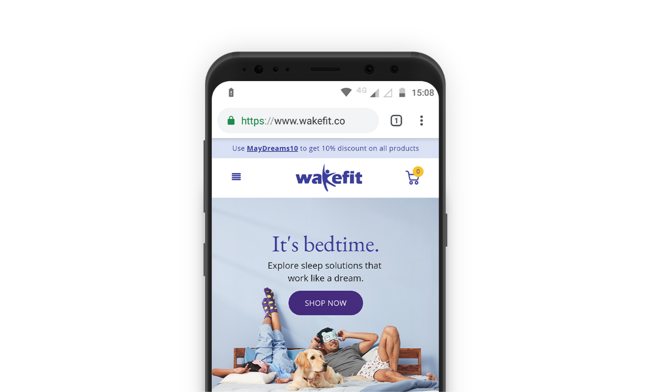
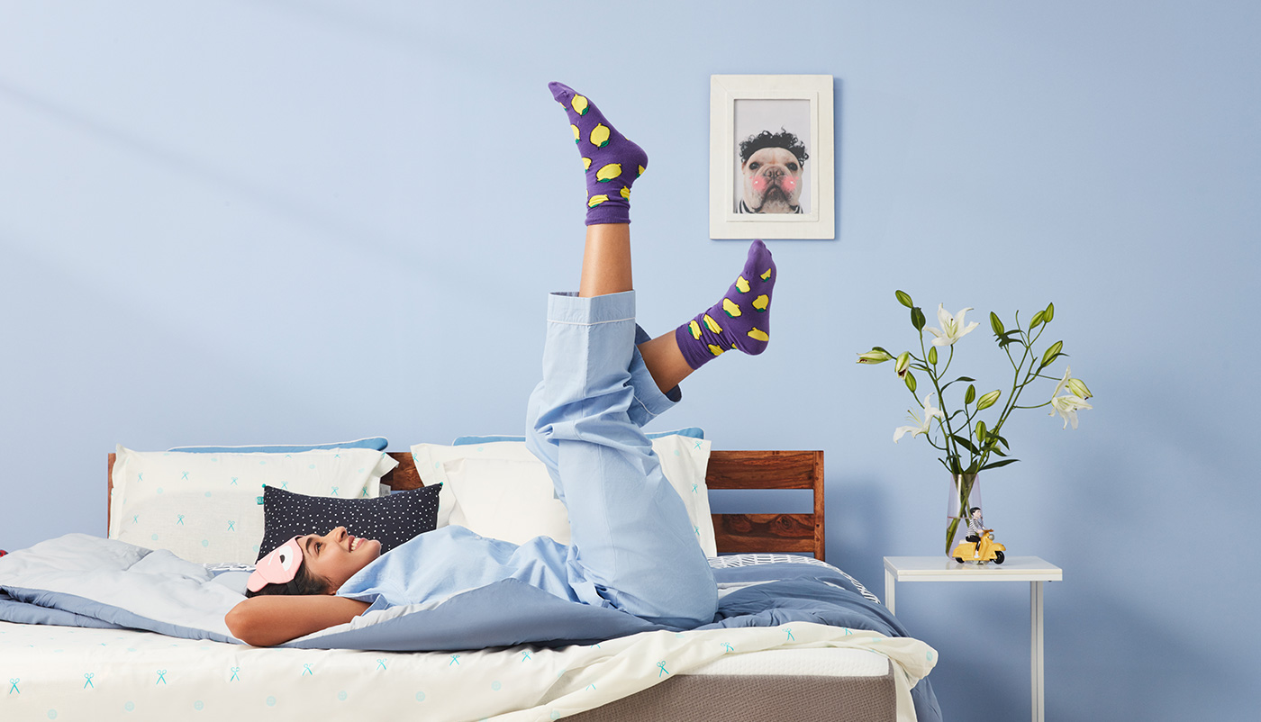
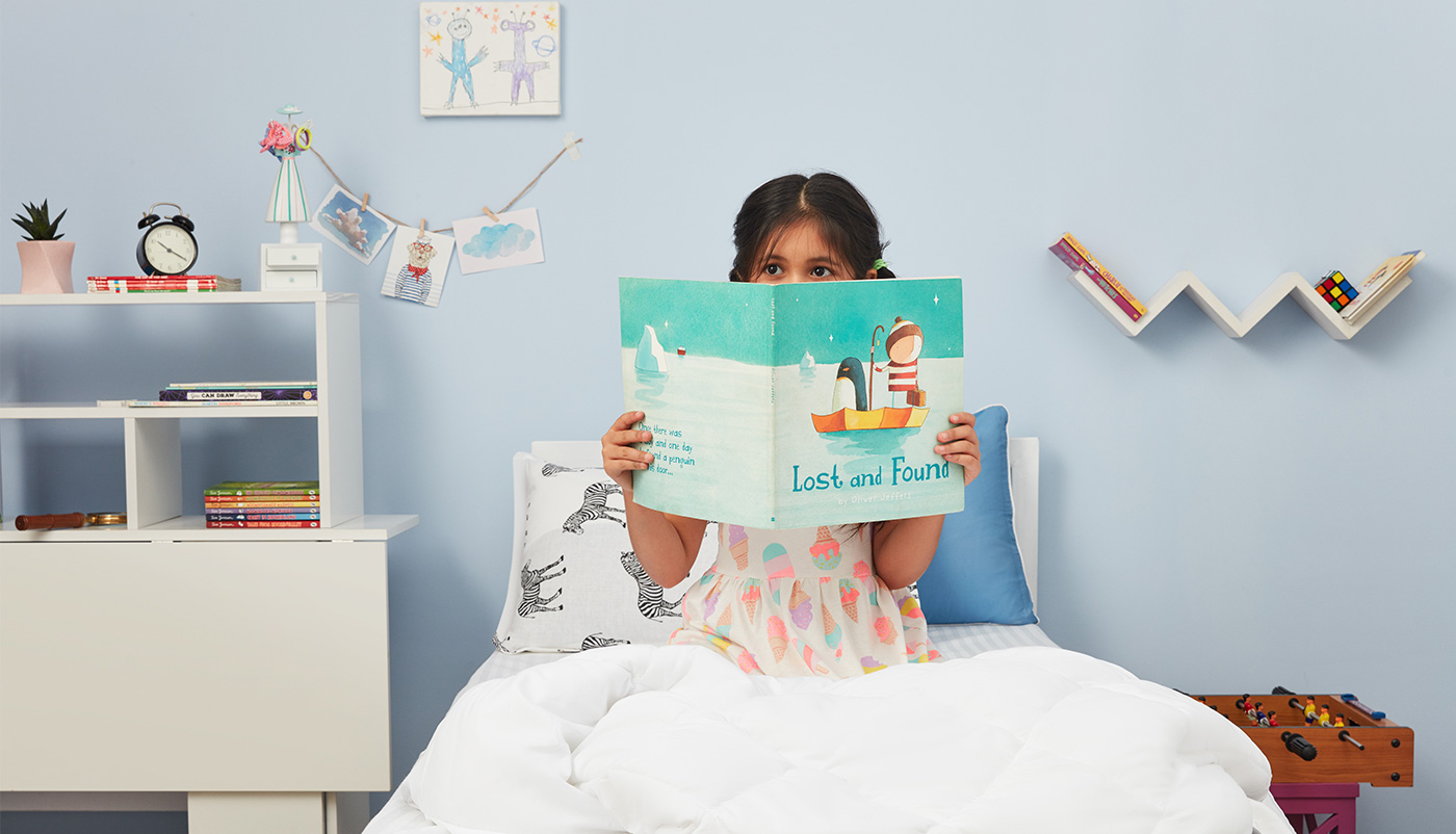
Being in the online business, the website is the brand’s most critical interface. We had to ensure the ease of navigation and the impression it gave of the brand. We relooked at the product photography, the tonality of its voice and applied the primary design principles, to make it a window to the world of Wakefit.
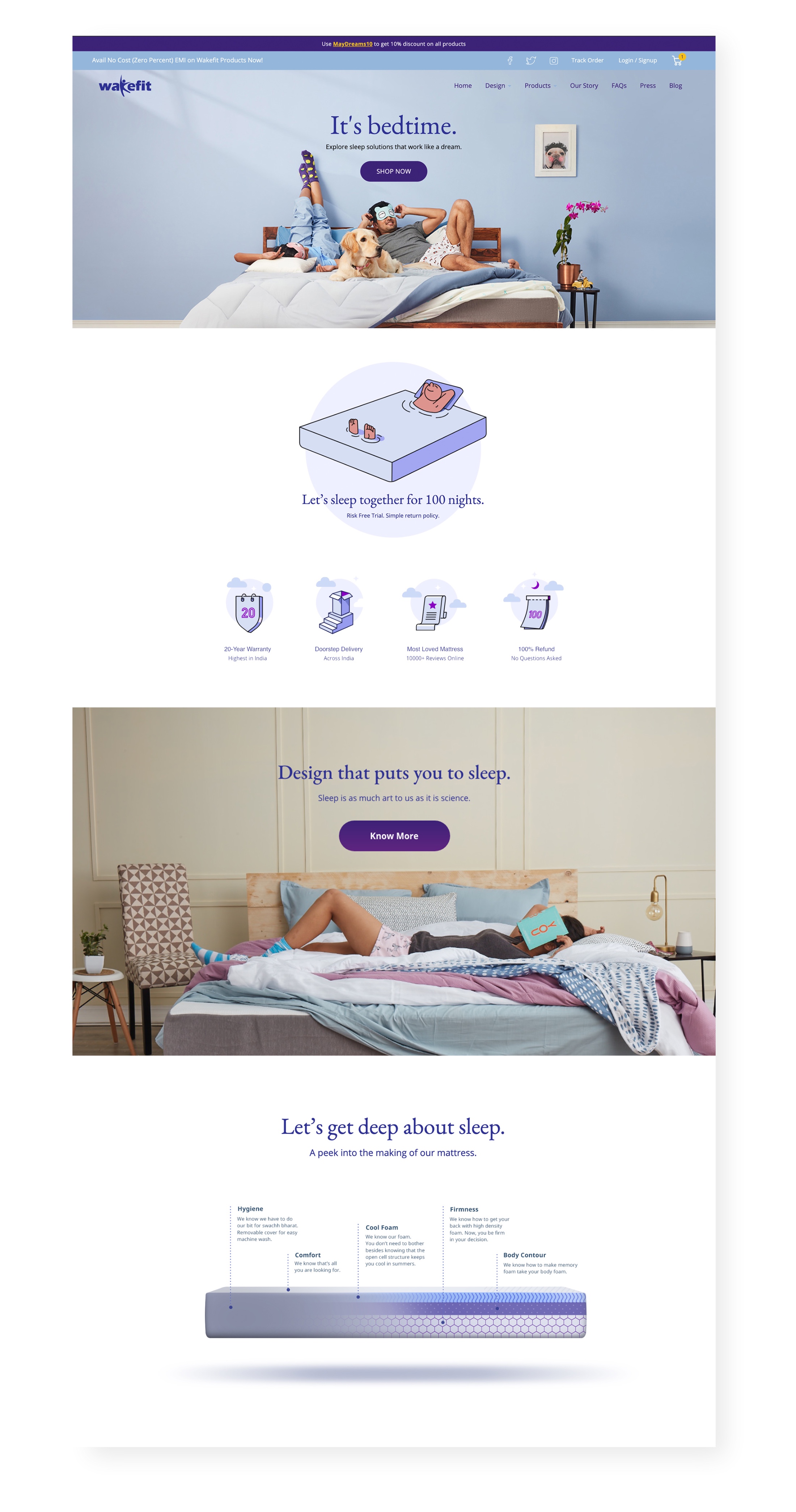
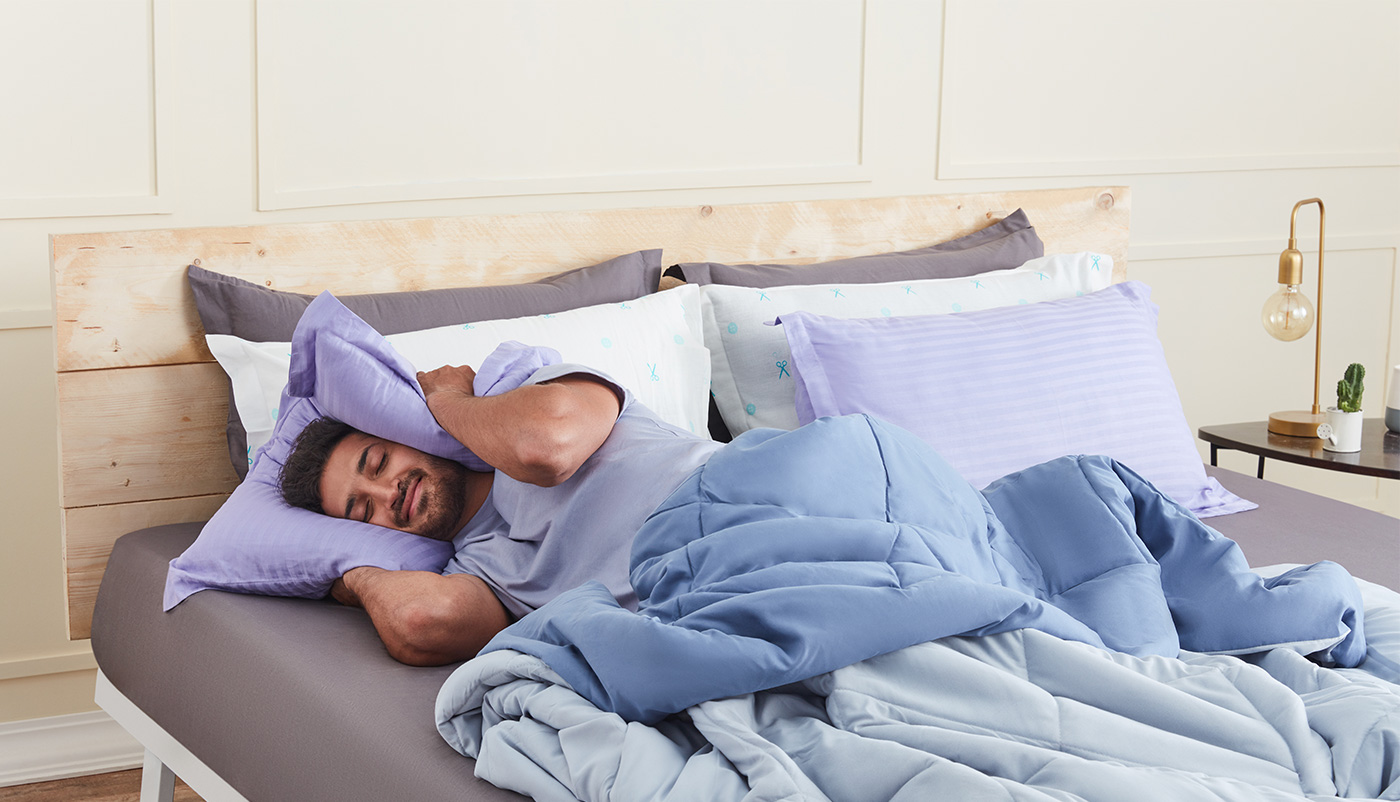
We chose a style that had a calm and breezy feel. Natural lighting with abundant whites, and hints of the Wakefit purple. With models in quirky acts and colourful charming props around, the photography creates a dream world that’s fresh and new-age.

Other Work